-
Emailteam@beyond-words.in
-
Phone+91 96670 32300


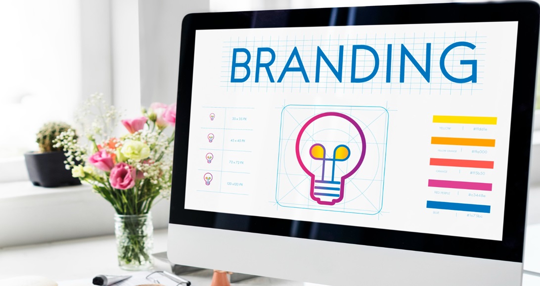
Top Design Mistakes That Weaken Your Brand Message
 July 29, 2025
 Team Beyond words
Good design is more than just aesthetics; it shapes usability, engagement, and customer satisfaction. At its best, it becomes a silent ambassador for your brand. Great design not only looks good but also communicates clearly, builds trust, and creates lasting connections. On the other hand, poor design does the opposite.
If your brand message isn’t landing, chances are design mistakes are to blame. From clashing visuals to sloppy typography, there are several design mistakes to avoid if you want to protect your brand’s credibility. Here are the most common culprits and how to fix them.
Inconsistent visual identity: Imagine Coca-Cola suddenly using a green logo in Comic Sans. Feels off, right? Inconsistency in fonts, colours, or logos chips away at brand recognition. Without a unified look, your brand feels disjointed and forgettable. The fix: create a style guide and stick to it as a rule.
Typography trouble: Typography mistakes are more common than you think. Bad typography is like background noise. It distracts, irritates, and forces your audience to work harder. Using too many fonts or ignoring hierarchy makes your message feel amateurish. A golden rule is - no more than two fonts, ideally paired for contrast and clarity. Think clean, not cluttered.
Colour chaos: A rainbow of colours might look playful but often reads as confused. Colours speak. Red is urgent, blue is calm, black is bold. Clashing or excessive hues dilute that message. Keep it simple with 2 to 4 colours that reflect your brand's personality, used with intention. It’s one of the easiest design mistakes to avoid.
Stock photo overload: People can spot generic stock images a mile away. Overused visuals feel impersonal and lazy. Instead, use custom photography or brand-specific illustrations that reflect real stories, spaces, or people. It adds authenticity and builds emotional connections.
The power of a style guide
A style guide is not just branding formality. It is your brand’s blueprint. It outlines everything - from logo use to tone of voice. This consistency not only boosts trust but also streamlines content creation across teams.
Design mistakes can be costly, but they're also preventable. Typography mistakes, inconsistent colours, and visual clutter often go unnoticed until they erode trust. Addressing these early helps keep your brand message sharp and your presence strong.
Design alignment is not just good practice. It is profitable. Studies show consistent branding increases recognition by up to 80 percent and revenue by over 20 percent. In a world overloaded with content, clear and cohesive design gives your message the edge it needs.
Because in the end, design isn’t just what people see. It’s what they remember, trust, and choose. And if your design doesn’t tell the right story, chances are your audience might write their own.
Start with your homepage - and see what story it’s really telling.